
From celebrating the meteorological prophecies of Pennsylvania’s favorite marmot on Groundhog Day to leaving celebrations to the professionals on International Sword Swallower’s Day, February is an interesting month. The Super Bowl, President’s Day, and most importantly, World Nutella Day have wedged themselves into February’s holiday portfolio to ensure an enjoyable end to a long winter season. Its calendar registers an array of month-long observances, as well: Black History Month, American Heart Month, and not least of these, Low Vision Awareness Month.
Low Vision Awareness Month highlights the experiences of millions of Americans living with low vision, a spectrum of different capacities such as blurred vision, color blindness, and partial vision loss, which require a spectrum of considerations when developing interiors. This month encourages accessibility planners to recognize how space can be utilized to communicate information and improve the experiences of anyone enjoying a commercial arena. To accomplish this, many designers have learned how to transform lighting, contrast, texture, and space into features of accessibility.
Lighting
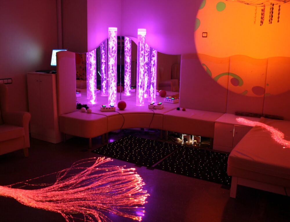
One of the foremost considerations of design for low vision is the lighting. Dim lights are a popular approach to a romantic mood for many restaurants and businesses looking to create ambiance for Valentine’s Day, however, lowering lights can often make experiences inaccessible to individuals with low vision. Activities like reading menus, appreciating art, or navigating sales racks becomes increasingly difficult when lights are dimmed. This doesn’t mean everything must be as bright as possible though. A wide variety of lighting is available that accounts for a range of conditions by reducing glare caused by blue light waves, while keeping an area well-lit and usable by those with low vision.
Subtle changes in lighting can also be used to denote change in an area’s use or purpose. For example, a waiting area may be lit differently from the remainder of a doctor’s office or restaurant, which may be lit differently from a bathroom or bar area, etcetera. This communicates that a particular room has a specific purpose that differs from other rooms, and helps orientate someone with low vision when they’re seeking a specific area.
Lastly, lighting can be used on a smaller scale to highlight features of a room that ensure safety. Lining stairs and hallways with lights can direct traffic in otherwise-dimly lit locations and allow patrons to recognize a clear path of travel, which can prove vital in emergency situations. Sconces along walls can be used to designate doorways or other features, while illuminated signage can make a remarkable difference in someone’s ability to maneuver a location.
Contrast
Stoplights, sports teams, and hospital emergency codes are long standing proof that humans like to use color to communicate, however, an even more conveying aspect of color to those with low vision is contrast. Where color combinations like blue and yellow or red and green may get lost to individuals with colorblindness, darkening or lightening tones creates a feature of design that can be utilized for accessibility in ways that appeal to everyone. Light on dark or dark against light provides a means to differentiate an array of elements, such as railing, stair steps, furniture, and operable parts like buttons, handles, or faucets. Setting light-colored dishes against a dark tablecloth, or installing dark toilet seats in a bathroom with light-colored tiles improves the visibility of an element.
Contrast can also be used to establish means of wayfinding. Alternating colors around doors and their frames, indicating points of interaction like service counters or sales racks with contrasted counters or shelves, and designating pathways with highly-contrasted flooring is a strategy that allows for individuals with low vision to navigate a space with independence. Where flooring cannot be modified to indicate a path of travel, contrast can be added with non-slip rugs or decals. The famed “accent wall” may be more than a trend; it can serve as a point in the right direction for navigators with low vision.
There is such a thing as too much contrast, though, as changes in color may also be interpreted as changes in distance by those with poor depth perception. Avoid using complicated patterns, such as checkerboard tiles, which can be disorienting in excessive amounts. Additionally, tall glass doors and windows can be marked by contrasting details like horizontal striping to maintain safety without sacrificing natural light.
Texture
Between braille and truncated domes, the use of texture is a familiar tool for those developing accessibility for both blind and partially sighted individuals. Tactile and audible cues, much like color contrast, capitalizes on non-visual sensations to convey warnings, establish a path of travel, and indicate a change in environment. Strategically installed flooring is a primary example of how texture can communicate a transition in an area’s purpose, such as a carpeted hallway that opens into a lobby with hardwood flooring. Small strips of textural changes can be used for wayfinding when placed in front of doorways, service counters, or even airport gates, provided they can’t be mistaken for tactile paving.
Texture can be applied to non-floor surfaces, as well. Changing the material used to construct different room elements like furniture, counters, and walls can communicate a change in purpose and allow those with low vision to recognize specific sections of a room. An illustration of this might be using one texture of shelving in a section of men’s clothing, while using another texture of shelving in a section of women’s clothing.
Space
There’s only 28 days in the month, meaning February has the perfect amount of leftover space for an extra day every now and then, yet space isn’t always utilized to its fullest potential when designing for people with low vision. How things exist in their physicality teeters on the border between practical and philosophical, but the way things are arranged can make an impact on whether or not an area is accessible to individuals with low vision. Large, open areas can make it difficult to establish direction or orientate oneself in a room. One of the best strategies to establish means of wayfinding within space is by using landmarks; similar to large-scale counterparts like the Eiffel Tower and Mount Fiji.
Landmarks — permanent structures that can be used to orientate oneself — can take on a limitless number of forms in interior design, including doorways, vending machines, fountains, sculptures, and furniture. They provide a reliable means to navigate through open areas by establishing distance as well as creating starting, stopping, or turning points that patrons can use to move independently of others. For example, an empty hallway may be difficult to navigate, however, dotting a distance with features like topiaries or photographs allows a person with low vision to count the features until they reach a destination. Space can also be used to establish paths of travel by grouping together furniture, kiosks, or other potential barriers, which in turn, makes a pathway safer by removing tripping hazards that put people with low vision at risk for injury. Pathways should also be clearly designated and direct, rather than winding, to ease any confusion that might arise with a change in direction.
Lighting, contrast, texture, and space are an arsenal of design that allow features to be used intentionally for people with low vision well beyond the month of February. Whether it’s a mundane daily errand or an exciting annual event, these design concepts are powerful tools that foster a synergy between form and function to transform a room into an experience shared by all. They build a bridge between communities to ensure that everyone has the opportunity to participate. On the sage advice of famed designer John Chris Jones: “Design everything on the assumption that people are not heartless or stupid but marvelously capable, given the chance.”


